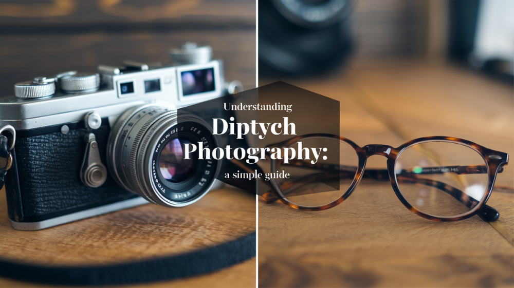
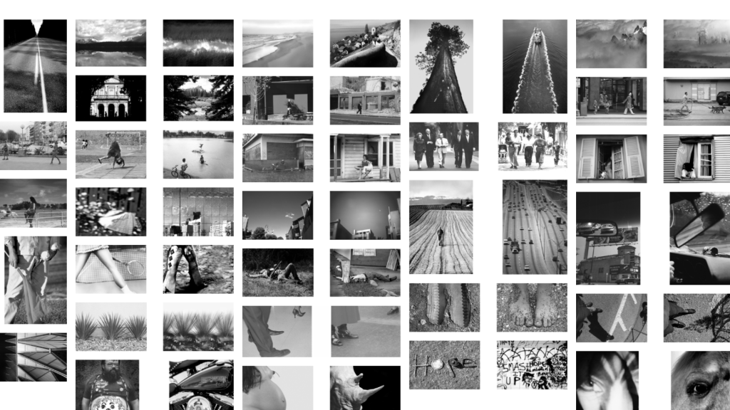
Sometimes, one photo just isn’t enough. That’s where diptych photography comes in. It’s a way to show two images side by side to tell a fuller story. The photos can show change, compare two things, or connect ideas that wouldn’t make sense alone.
If you’re trying to add more meaning to your photos or want to try something new that stands out, this blog is for you.
Maybe you’re curious about how diptychs work. Maybe you’ve seen some online and want to learn how to make your own. Either way, you’re in the right place.
We’ll talk about what diptych photography is, some famous inspirations, and some common mistakes.
What is Diptych Photography?
Diptych photography is when two photos are placed next to each other to create one single piece. These photos usually connect in some way. They might show a before and after, two different views of the same subject, or tell a small story together.
The photos can match in mood, color, or subject—or they can be totally different to show contrast. What matters most is that they work as a pair.
The word “diptych” comes from the Greek word diptychos, which means “two-fold.” In ancient times, people used wooden panels with two parts that folded like a book. Artists later used diptychs for religious paintings. Today, photographers use this idea in a creative and modern way.
You might also hear about triptychs, which are three-part photo sets. These add one more layer to the idea. There are also larger series with four or more photos, but diptychs keep it simple and focused.
Two images are enough to create a strong message without overwhelming the viewer. This makes diptych photography perfect for beginners and pros alike. It’s a fun way to add more meaning and style to your work using just two frames.
How to Create a Diptych (Beginner-Friendly Guide)
Creating a diptych—a pair of images placed together—can tell stories, show contrast, or highlight similarities. Follow these simple steps to craft your own compelling diptych.
Step 1: Choose a Concept or Theme
Start your diptych by selecting a clear, simple theme. A strong idea ties your images together and helps viewers understand your message. Popular themes include before-and-after comparisons, contrasting colors or emotions, and related storytelling.
Choosing a familiar or personal topic can make it easier to capture meaningful photos. Once you’ve picked a theme, think about the story you want your images to tell. The clearer your theme, the more powerful your diptych will be.
Step 2: Plan or Capture Complementary Images
Next, take or select two images that clearly fit your theme. Your photos should either complement or contrast with each other. If you’re capturing new images, plan your shots carefully. Consider composition, lighting, and subject placement.
For a good diptych, keep elements like color schemes or framing similar in both images. For contrast, emphasize differences.
Step 3: Edit for Contrast
After choosing your photos, edit them to strengthen your theme. Editing helps your diptych feel cohesive or intentionally different. Adjust brightness, contrast, saturation, and colors. For better diptychs, apply similar filters or editing styles to unify your images visually.
For diptychs focused on contrast, exaggerate differences by editing images distinctly, like a vibrant, colorful image next to a black-and-white photo. Simple editing apps like Lightroom or Snapseed are ideal for beginners. Make subtle changes rather than over-editing; too much editing can distract viewers from your message.
Step 4: Arrange Your Diptych (Side-by-Side or Stacked)
The most common layouts are side-by-side (horizontal) or stacked vertically. Side-by-side arrangements often suggest direct comparison or equality between images. Vertical arrangements can show hierarchy or sequence, like before and after shots.
Pay attention to visual balance, ensuring neither image feels overwhelming. Apps like Canva or Adobe Express simplify arranging photos into neat, professional-looking diptychs. Preview arrangements in multiple ways to choose the layout that clearly communicates your chosen theme. Remember, your arrangement directly impacts the viewer’s interpretation, so experiment thoughtfully.
Step 5: Export and Share/Print
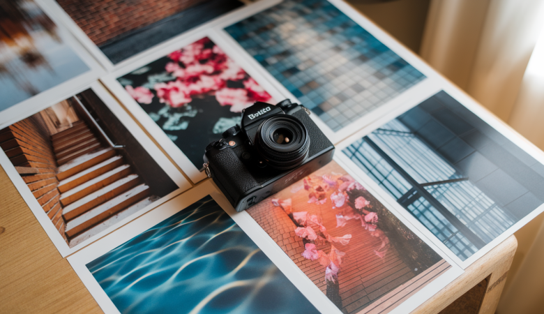
Finally, export your completed diptych. For digital sharing, export high-quality JPEG files suitable for social media or online portfolios. Ensure resolution is sharp enough for clear viewing on all devices. If printing, choose high-resolution images (300 dpi) for crisp results.
Print size depends on your purpose—smaller prints for personal spaces or larger formats for exhibitions. Frame your diptych neatly if printed, using simple frames that don’t distract from your images. Share digitally on platforms like Instagram, clearly describing your theme in captions to engage viewers.
Why Use Diptychs in Photography?
Diptychs are a simple way to tell deeper stories using just two images. They let you show a bigger idea, like change, emotion, or a connection, without needing many words. You can use them to capture time passing, the two sides of a moment, or how two things relate.
They also help create emotional or theme-based impact. For example, a photo of a child’s hand next to an elderly hand says something about age, time, and love without saying anything at all.
Another reason to use diptychs is for contrast and comparison. Bright vs. dark, calm vs. busy, happy vs. sad—two pictures can show how different things really are.
Lastly, diptychs are great for trying new ideas. You can break rules, play with angles, or mix styles. It’s a fun way to explore your creative side without needing fancy gear or setups.
1. Before and After
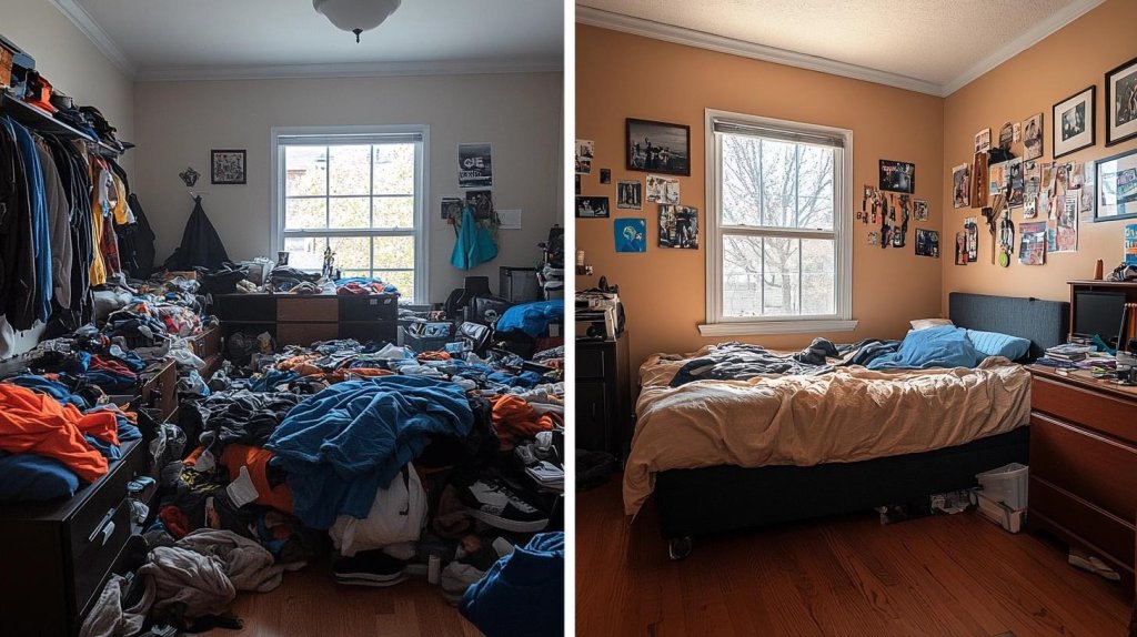
This theme shows how something changes. You take two photos of the same thing—one before something happens, and one after. It works well for people, places, or objects. It helps show growth, time, or transformation.
You could show a haircut, cleaning a room, baking a cake, or a snowman melting. These pairs help people see how time changes things in a simple, clear way. It feels real and honest.
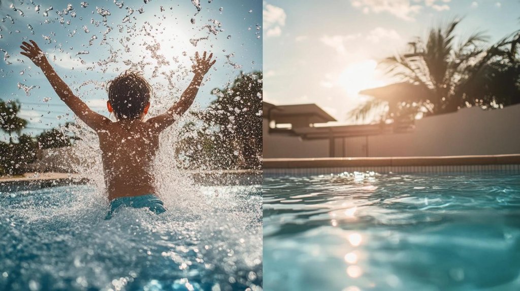
2. Two Perspectives of the Same Subject
This theme helps show more than one side of something. You take two photos of the same subject from different angles or distances. It could be from above and below, front and back, or near and far. This helps people understand the subject better.
It’s useful for things like faces, animals, or objects with details. These photos work best when taken at the same time and place.
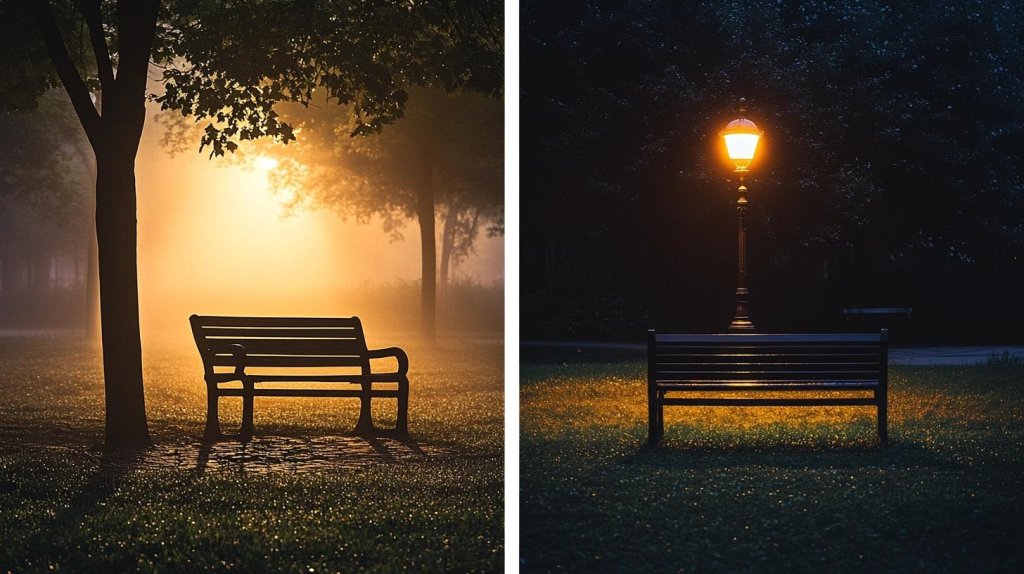
3. Light and Shadow
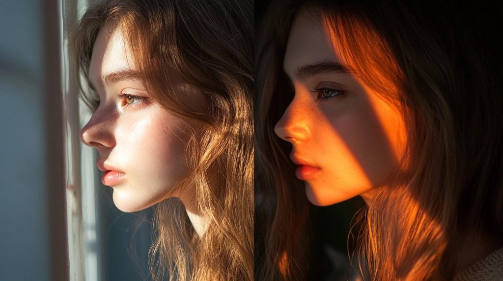
This diptych uses light to tell a story. One photo should be bright and full of light, while the other shows shadows or darkness. The light might come from the sun, a lamp, or even a candle. This helps show how light changes the mood or feeling of a photo.
It’s great for faces, rooms, or quiet places. You can make the same subject feel happy or mysterious, just by changing the light.
4. Movement and Stillness
This theme uses action and calm to show contrast. In one photo, something is moving fast—maybe a person running, leaves blowing, or cars zooming by. In the other photo, everything is quiet and still. This makes you feel the difference between energy and peace.
It’s a great way to show how the world changes quickly, but also has slow moments.
5. Nature and Urban
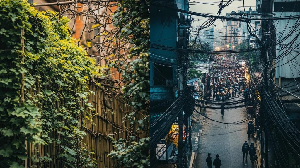
This diptych shows the difference between the natural world and the man-made world. One photo shows something from nature, like a tree, river, or bird. The other shows something from a city, like buildings, roads, or people walking.
This helps people see how different these two worlds are. But sometimes they also look surprisingly alike.
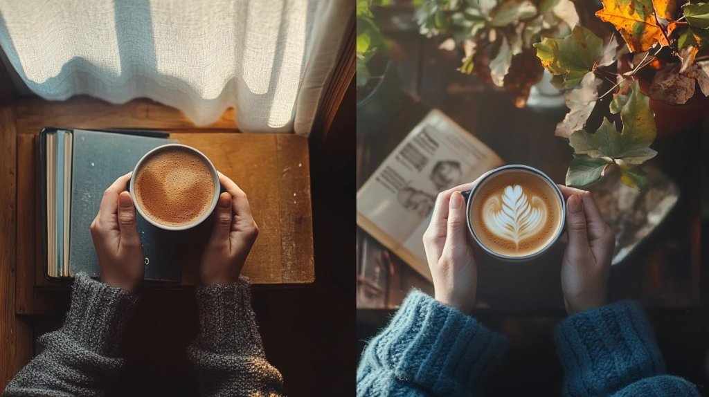
6. Time Progression (e.g., Day vs. Night)
This theme shows how something changes over time. You take photos at different times of day or even during different seasons. One might be in the morning, and the other at night. Or summer vs. winter.
This helps people feel time passing. It works best when the subject stays the same, but the lighting, color, or feeling changes.
7. Color vs. Black and White
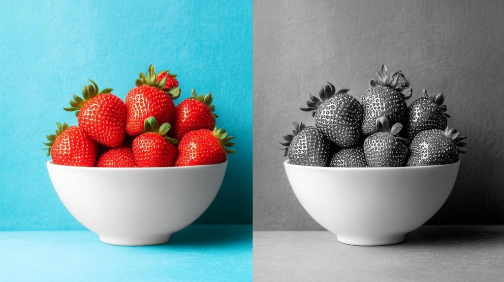
This theme shows how color changes the feeling of an image. One photo is in full color, while the other is black and white. Both should show the same or similar subjects.
The color photo grabs attention, while the black-and-white one focuses more on shape and contrast. This makes people look closer and think differently about the subject.
8. Emotion and Expression
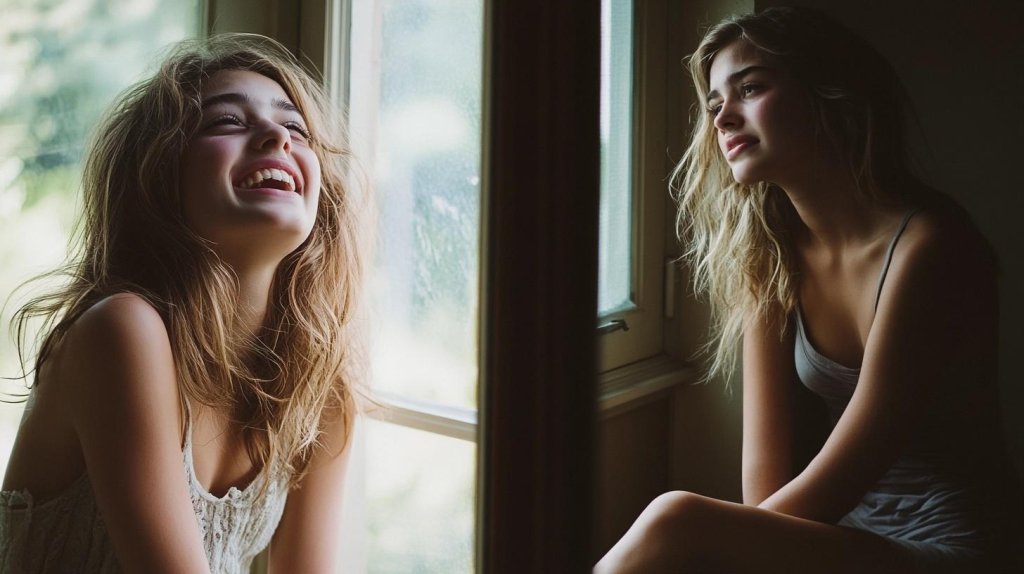
This diptych shows feelings through people’s faces or body language. One photo might show joy, like someone smiling or laughing. The other might show sadness, anger, or quiet thinking. You can use the same person or different people.
This type of photo helps people feel connected and see real human emotions.
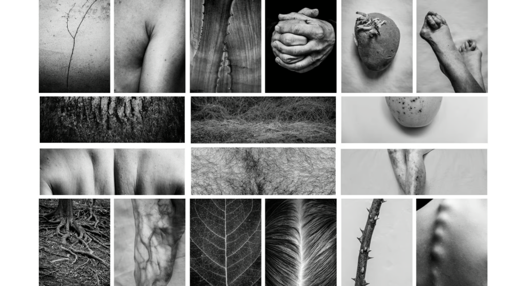
9. Abstract Visual Pairs
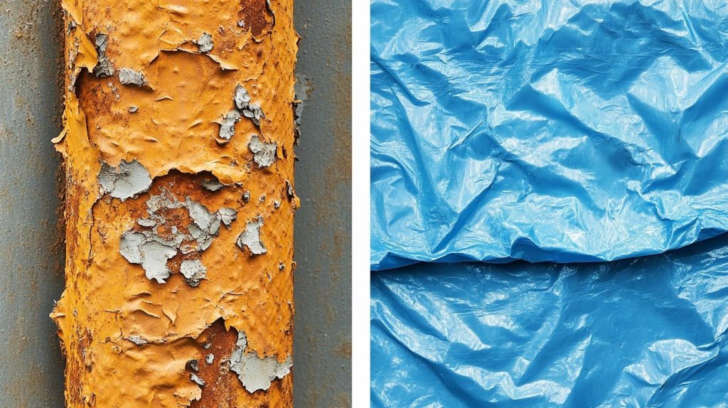
This theme doesn’t use faces or clear subjects. Instead, it uses shapes, textures, colors, and patterns. The photos don’t have to match, but they should look interesting next to each other. You might take a close-up of peeling paint or cracked concrete.
This type of diptych makes people look closely and notice tiny details.
10. Conceptual or Symbolic Pairings
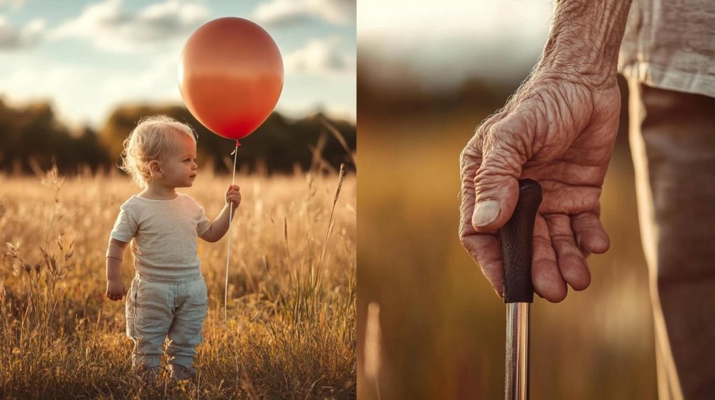
This theme tells a deeper story using symbols. Each photo stands for something. You might use life and death, youth and old age, or growth and decay.
It’s not just about what’s in the photo—it’s about what it means. These diptychs make people stop and think about the message.
Famous Diptych Photographers and Projects
Alicja Brodowicz
Alicja Brodowicz is known for her unique visual exercises using diptychs. She explores themes of perception and reality, combining images to show contrasts and connections.
Brodowicz often uses minimalistic subjects to create strong visual statements. Her work encourages viewers to think deeply about how images relate to each other.
John Bernhard
John Bernhard is another photographer who creates surreal diptychs. His work blends unexpected elements to challenge the viewer’s perception. By pairing unrelated images, Bernhard forms a new, often dreamlike narrative. His diptychs invite curiosity and imagination. He uses a lot of contrast and mystery, making his photos feel almost like a visual puzzle.
Both photographers use diptychs to tell stories that are more than just about the images themselves. Their work shows how pairing two images can create deeper meanings and unique experiences for the viewer.
Tips for a Strong Visual Connection
To create a strong visual connection in your diptych, start by using similar color tones or lighting in both images. This helps tie the two photos together and gives them a unified look.
You can use warm or cool tones in both images, or match the lighting conditions, like both being taken during the golden hour, for a soft, natural feel.
Another tip is to align subjects or lines across the two images. This could be something simple like matching the horizon line or ensuring that a subject in one image flows into the other. This alignment guides the viewer’s eyes naturally from one image to the next, making the connection between them stronger.
Lastly, keep the framing and composition consistent. If one photo is close-up, try to keep the other similarly framed, or use the same angles and perspectives.
Consistency in framing and composition helps to maintain a smooth, cohesive feel in the diptych. These simple tips will help your images work together more effectively.
Conclusion
Diptych photography is a great way to tell a story with two connected images. It lets you show a deeper meaning by linking the pictures together.
By focusing on how the images relate to each other, you can create something unique. It’s a fun way to get more creative with your photography.
Remember to think about balance and contrast when choosing your images. These small details can make your diptych stand out.
If you want to keep improving, keep experimenting with different ideas. Check out more of our blogs for tips and inspiration to help you grow as a photographer!


Leave a Reply