Photography is a visual language that uses the interaction of numerous components to convey concepts, feelings, and narratives. Among these components, color is crucial in setting the tone, expressing the message, and grabbing the viewer’s attention. A painter’s palette may be compared to the effective use of color photography since each shade and hue acts as a brush stroke that modifies the viewer’s perception.
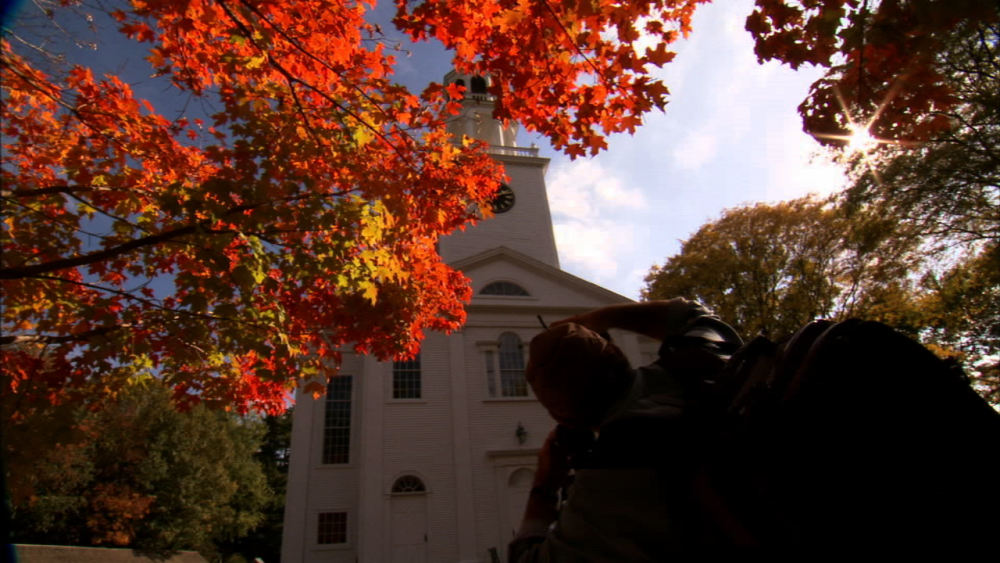
Framing the color is a potent technique photographers use to improve their compositions. This strategy involves carefully placing colors within the frame to direct the viewer’s attention, arouse feelings, and provide a more appealing story.
Through illustrated examples of framing in photography, we shall explore the realm of framing with colors in photography in this article.
Examples of Framing with Colors in Photography
1. Warm Vs Cool Colors for Creating Mood
The difference between warm and cold colors is crucial in determining the atmosphere of a picture. Red, orange, and yellow are examples of warm hues that arouse sensations of warmth, vinegar, and desire. On the other hand, cold hues like blue-green and purple evoke feelings of peace, tranquility, and sorrow. The warm tones of the sun’s reflection on the sea are a snapshot of a quiet beach scene at sunset, creating a beautiful and peaceful atmosphere. Alternatively, a foggy woodland scene with a predominance of greens and Blues might inspire a feeling of mystery and introspection.
2. Contrast the Emphasis
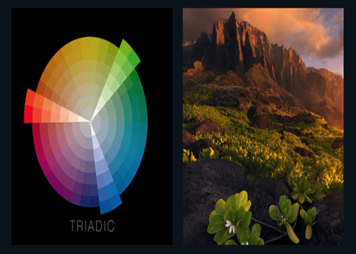
When used properly, contrasting colors can bring the viewer’s attention to a particular topic or component inside the frame. Photographers may create a startling visual impact by putting complementary colors that are opposite one another on the color wheel, which is side by side. For instance, the contrast between a single flower and a swath of green grass is an image that makes the bloom stand out immediately. The viewer’s eye is drawn straight to the subject by the striking contrast in color intensity.
3. Color Harmonies- Conveying Unity
Harmonious color schemes help the image feel cohesive and well-balanced. On the color wheel, analogous colors are next to one another harmoniously and can evoke a sense of coherence. Imagine a street snapshot of the market scene, with the earthy browns of the wooden market stalls blending harmoniously with the warm oranges and reds of the fruits and spices. This color harmony may create the familiarity and warmth of the setting.
4. The Symbolism of Color
Colors frequently have emotional and cultural values that may be used to communicate symbolic meanings. For instance, red is commonly linked to love and strength, but why denote Innocence and purity? These associations may help photographers develop their stories. In a picture, the red may represent the subject’s vigor and power, and the white background purity.
5. Monochromatic Expressions
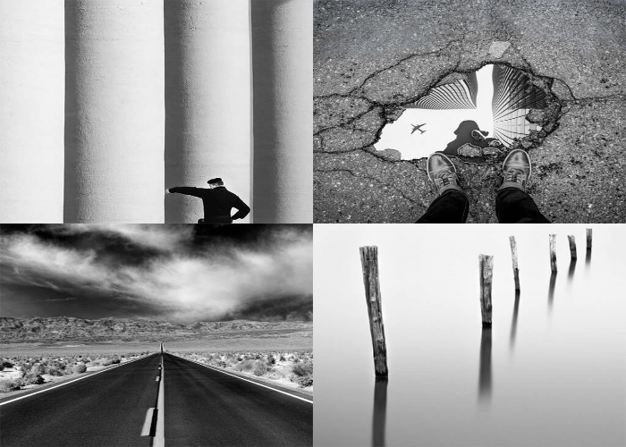
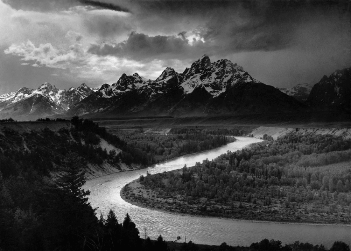
When one dominates the scene, monochromatic photography makes him walk in a certain mood and highlights form and texture. A sepia-toned snapshot of a historic city street, for example, might conjure up nostalgia and take viewers back in time. Monochromatic techniques may also intensify feelings; for example, a grayscale photograph of a wet street might draw attention to a sense of sorrow.
6. Subtle Accents
These accents may be made to stand out drastically by using a color scheme that is mostly neutral or subdued and a few minor additions of bright color. A crimson umbrella stands out in a black-and-white image of a sea gray, and it might represent either protection from or rebellion against an uninteresting world.
7. Storytelling Using Color Grading
In the era of digital photography, post-processing methods may be used to improve the narrative quality of an image. To elicit particular feelings or moods, color grading entails changing the overall color balance and tone of a picture. A desaturated and chilly color grade may be applied to an image of an abandoned structure to induce feelings of loneliness and sorrow and to emphasize the story of abandonment and deterioration.
Conclusion
All in all, colors are an effective tool in a photographer’s toolbox since they may affect feelings, direct attention, and express a message. Colorful framing is an intentional approach to influence the viewer’s perspective and improve the narrative an image conveys. It is not only about aesthetics.
Photographers may improve their compositions to produce fascinating and impactful visual experiences by mastering the technique of color manipulation.
Warm or cold tones, contrasts, harmonies, symbolism, monochromatic selections, subtle accents, and intentional color grading are just a few of the ways that the language of colors enhances the photographic visual narrative.
Frequently Asked Questions
How Can I Improve My Photos Using Color Framing?
Using components from the scene to draw a border of color around your subject is known as color framing. Select colors that go well with your topic and provide visual appeal to the composition to improve your photos.
What Function Do Opposing Hues Provide in Color Framing?
Your topic will stand out and have a more dynamic appearance when you use contrasting colors, such as setting a subject up against a background with a matching hue.
What are Some Suggestions for a Color Scheme that Looks Well-Framed?
Purple and yellow, red and green, and blue and orange are a few of the often-used combos. Try out different combinations to determine which ones suit your topic and mood the best.


Leave a Reply